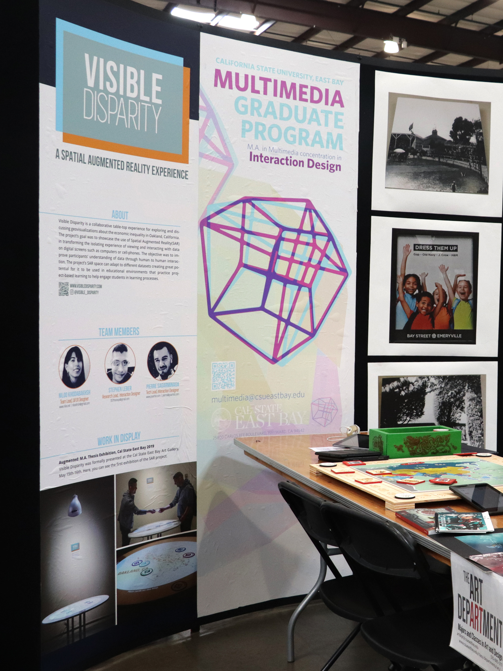
Roles: Project Lead, UX/UI Designer, Visual Designer
Collaborators: Stephen Leber, Pierre Sagarminaga
Duration: January 2019 - May 2019
Designed and Created as Multimedia Masters' Thesis Project, California State University, East Bay

The Problem
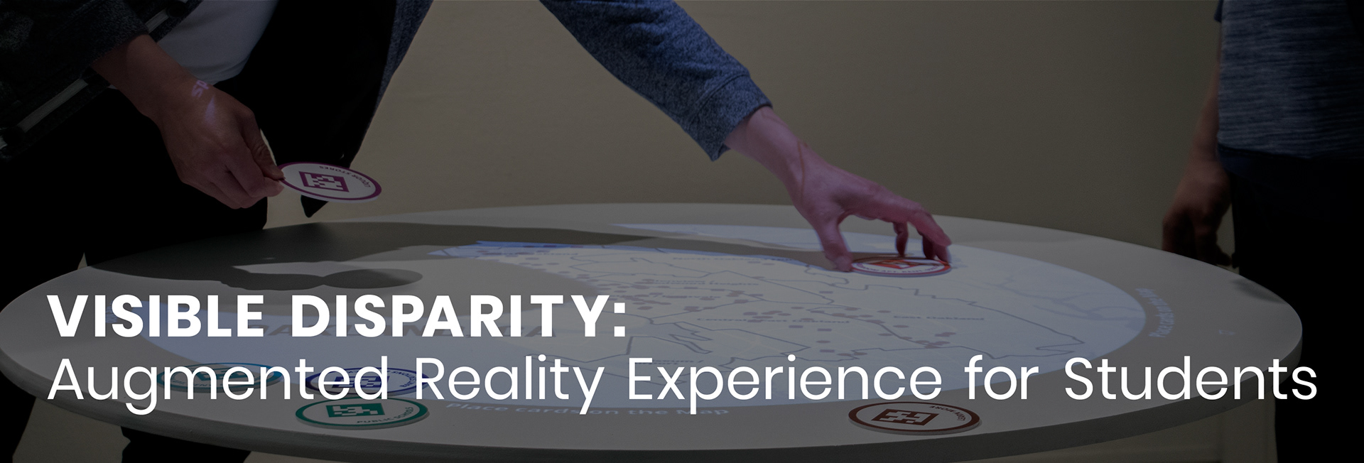
Cell-phones and computers have become common platforms for people to view data visualizations. Though these interfaces have had great improvements over the years, they provide only a singular experience that is not entirely suitable or appropriate for groups of people wishing to analyze and discuss their data together in the same space.
Main Goals
• Free users from constraints of singular experience of viewing data visualizations
• Let users explore data in their own pace
• Encourage human to human interactions rather than human to computer interactions
• Let users explore data in their own pace
• Encourage human to human interactions rather than human to computer interactions

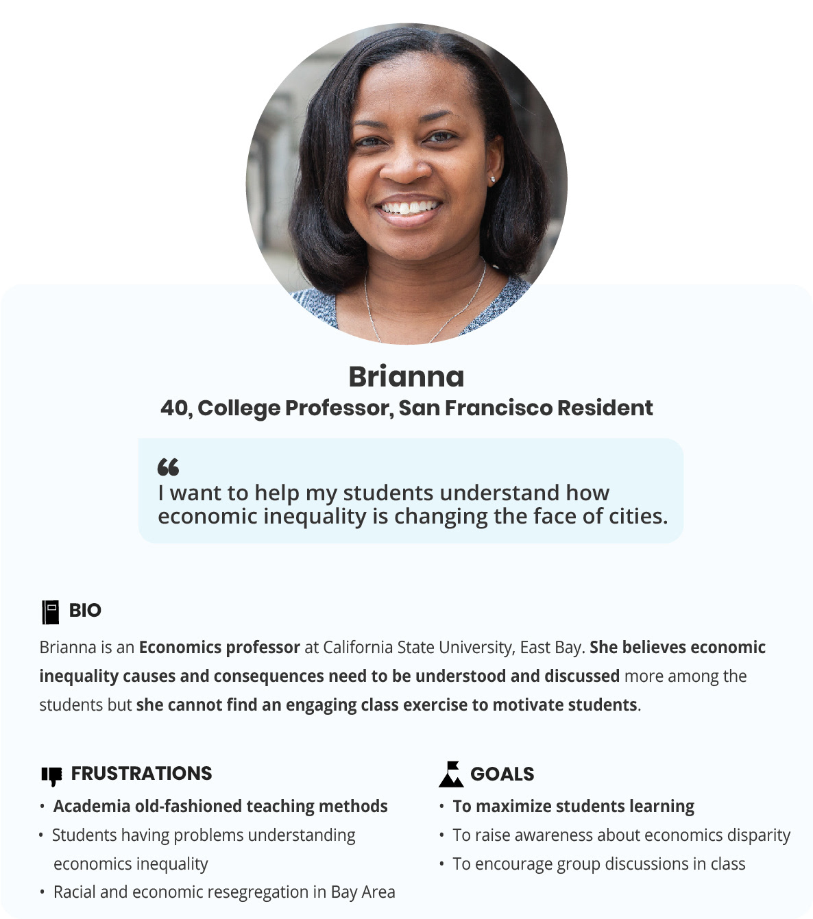
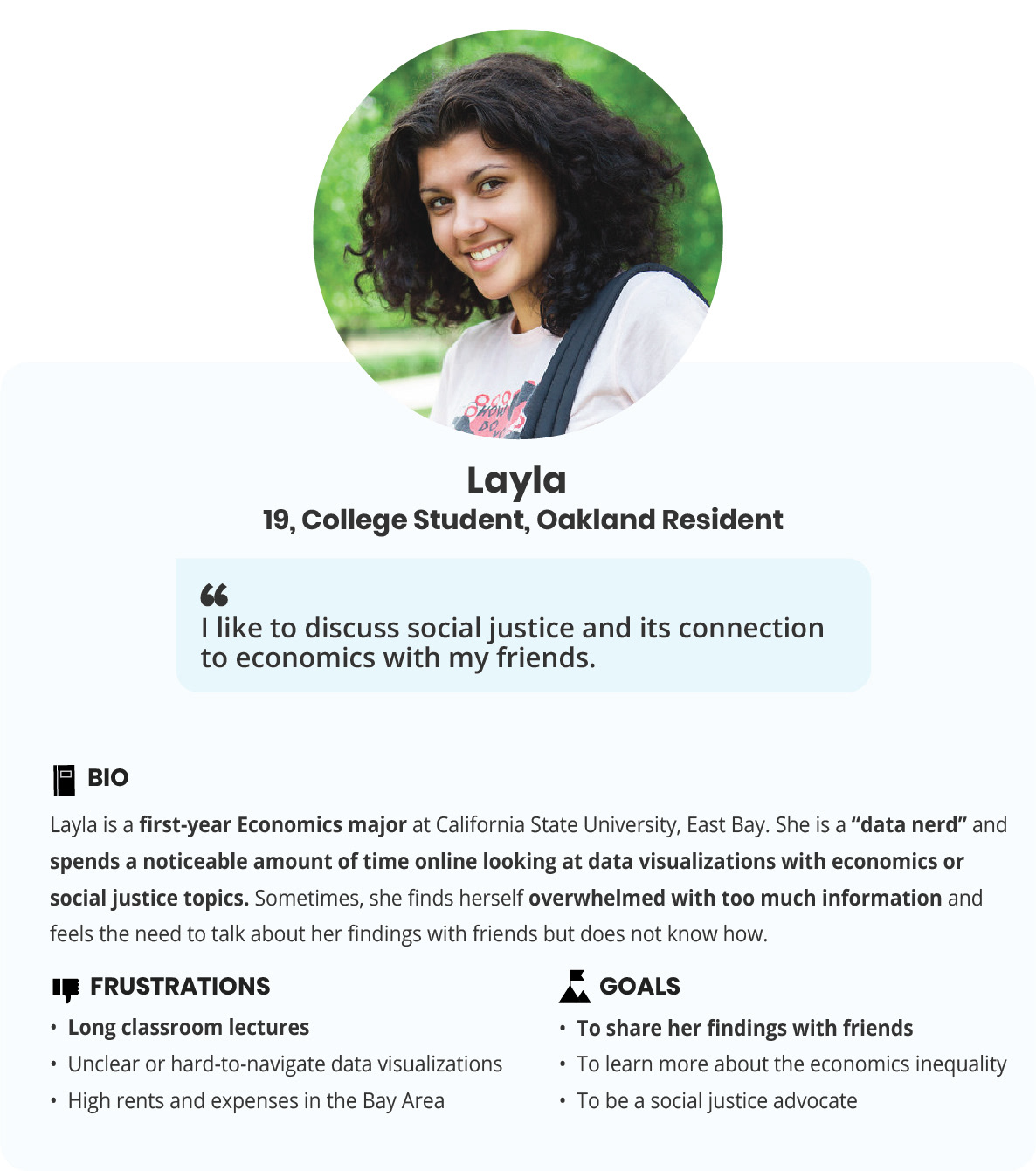
The Users
Having a shared space to view and interact with data can be especially useful in educational environments such as classrooms. Group activities engage students more with the subject matter and can improve their understanding of the course.
Design Solution
To discuss data in a group setting, users needed to be able to view the same data in their environment.
Our team was looking for a solution that:
• made the experience of looking at data fun
• encouraged collaborations and discussions
• did not limit the content to a single device such as a cell-phone, computer or a headset
• was easy to set up in classrooms
• made the experience of looking at data fun
• encouraged collaborations and discussions
• did not limit the content to a single device such as a cell-phone, computer or a headset
• was easy to set up in classrooms
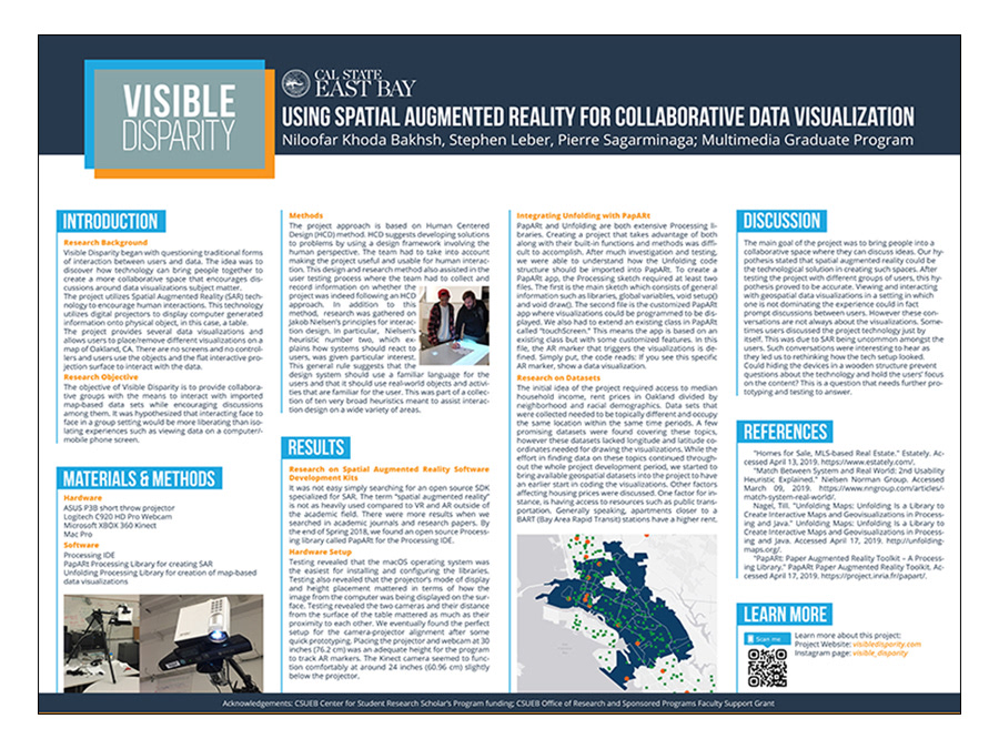
After doing a thorough research, we decided that Spatial Augmented Reality (SAR) was the ideal technological solution. SAR augments the real world by using digital projectors to display information on physical objects. By taking devices such as monitors, headsets or mobile phones, it creates an environment for collaboration and conversation.

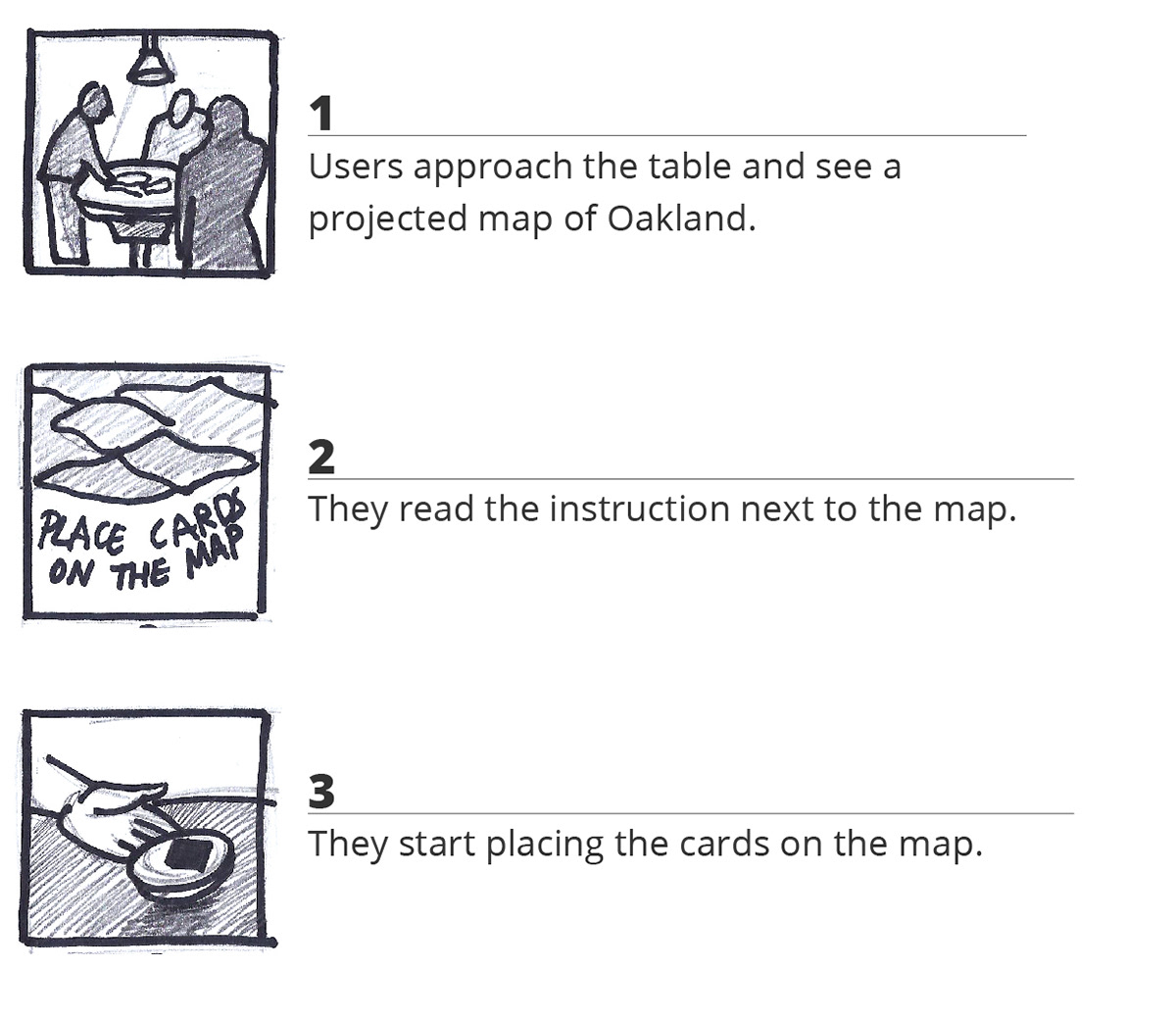
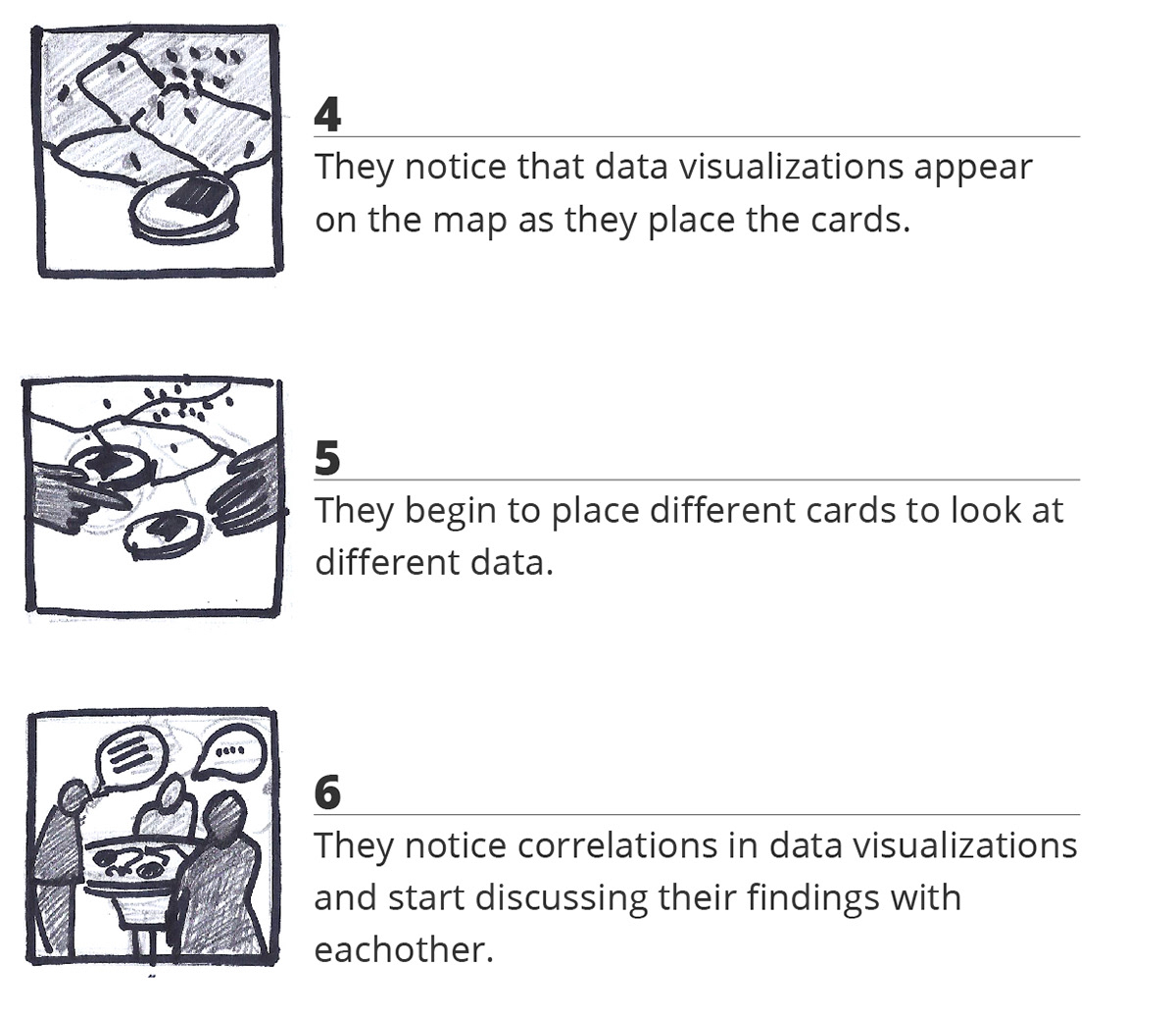
The User Journey Storyboard
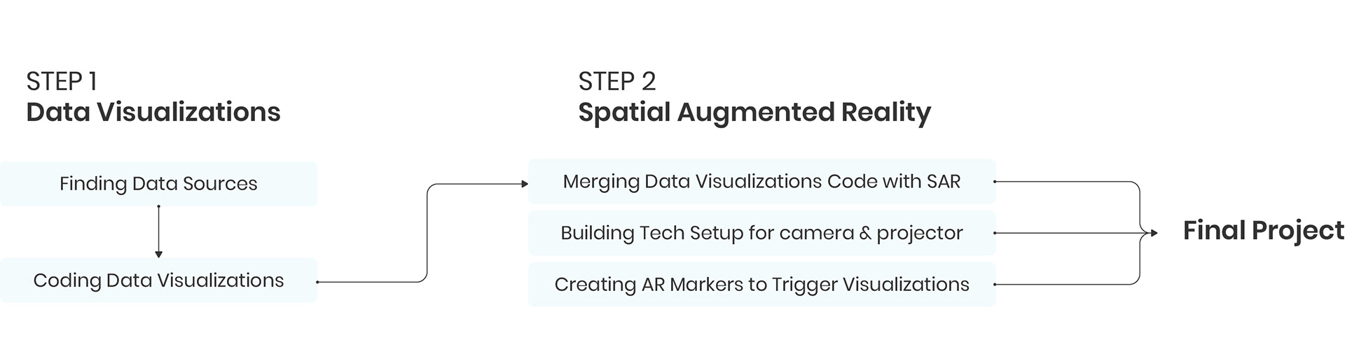
Project Development
Tools & Technology
• Processing 3, JAVA Mode
• Processing Libraries: PapARt 1.4, Unfolding Maps
• Adobe Illustrator
• Processing Libraries: PapARt 1.4, Unfolding Maps
• Adobe Illustrator
• Laser-Cut Machine
• ASUS P3B Projector
• Logitech Brio Camera
• ASUS P3B Projector
• Logitech Brio Camera
Step 1:
Data Visualizations
Data Visualizations
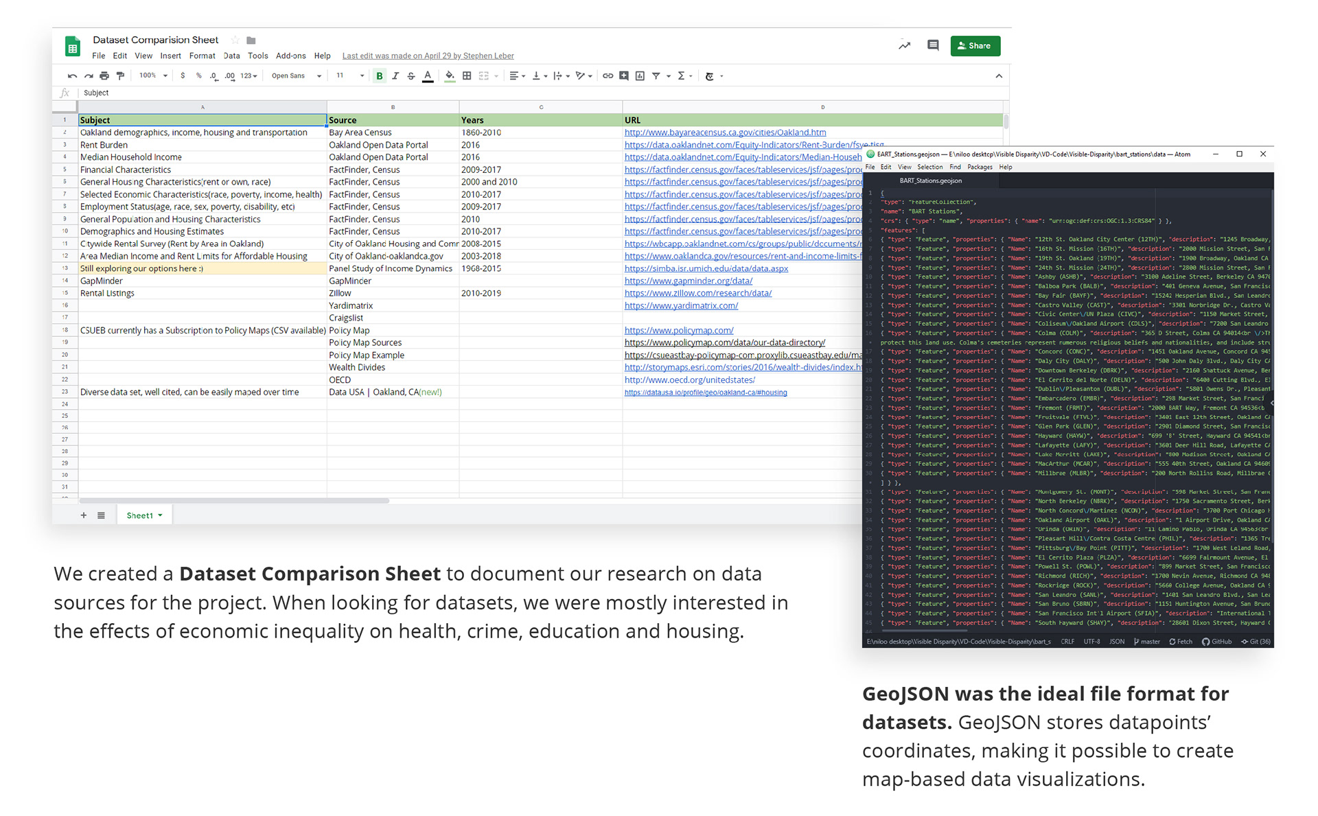
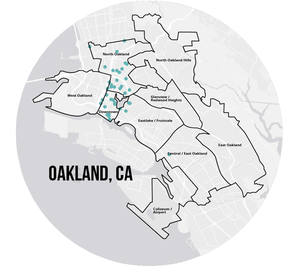
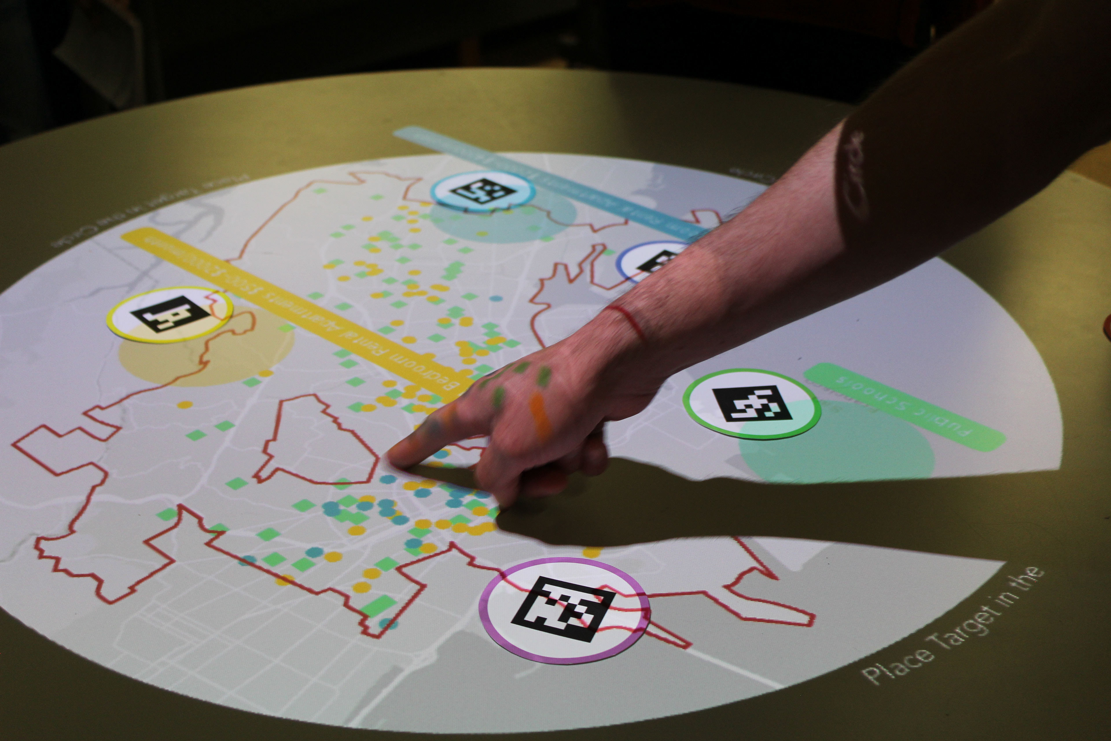
During brainstorming sessions, we decided to focus on the problem of economic inequality in Oakland, California. This topic allowed us to test and showcase the potentials of the SAR table we were creating. We began the research by looking into resources such as Census and City of Oakland website. In some cases we created our own datasets using Google Maps information. What mattered most when looking for datasets was to export the data into GeoJSON format. GeoJSON stores each data point coordinates, making it possible to create map-based data visualizations.
After few datasets were gathered, I proceeded to the next step: designing and coding the data visualizations.
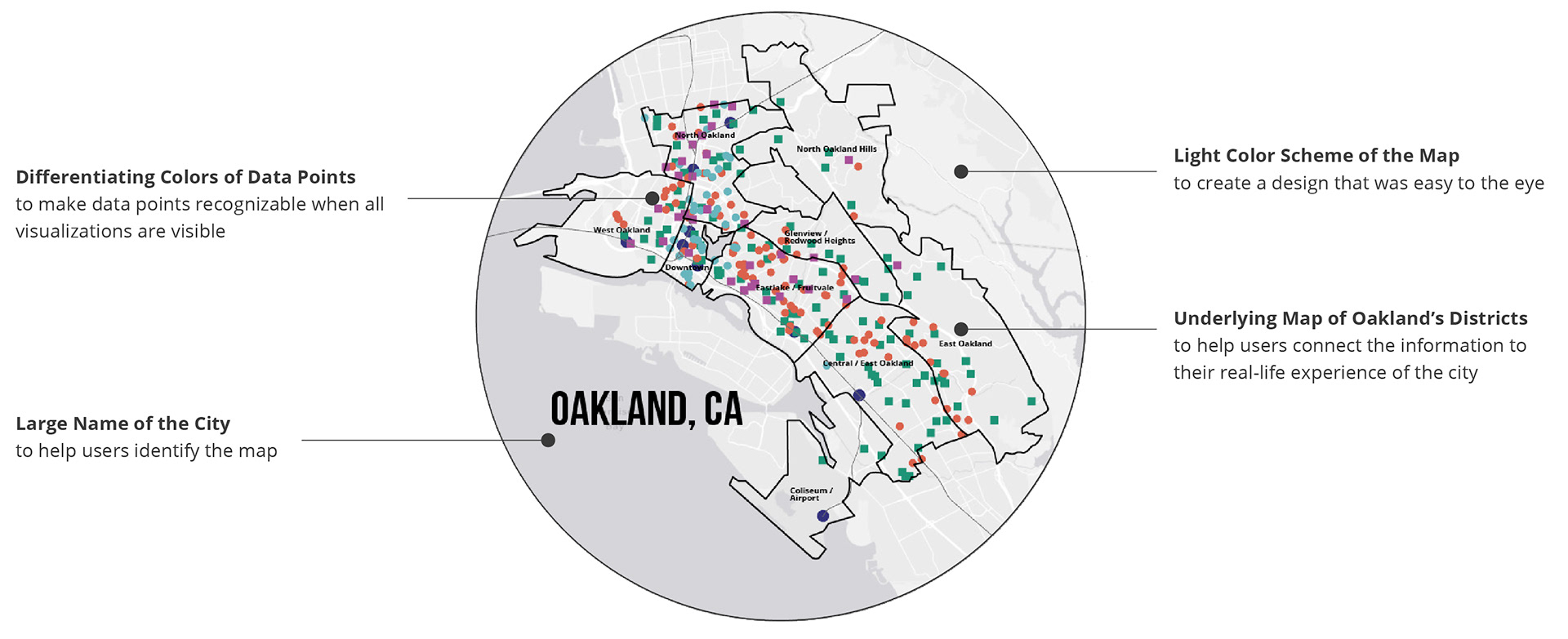
To do that, I used the Unfolding Maps library for Processing 3. I imported each dataset GeoJSON separately. Then, I created and customized markers for each data point by writing JAVA classes. Designing the data visualizations was an iterative process. At last, we decided a light-color theme works better when projected on a table.
To do that, I used the Unfolding Maps library for Processing 3. I imported each dataset GeoJSON separately. Then, I created and customized markers for each data point by writing JAVA classes. Designing the data visualizations was an iterative process. At last, we decided a light-color theme works better when projected on a table.
The final five data visualizations visualize data of:
• low-end rent for one bedroom apartments
• high-end rent for one bedroom apartments
• liquor store locations
• BART stations and tracks
• public schools
• low-end rent for one bedroom apartments
• high-end rent for one bedroom apartments
• liquor store locations
• BART stations and tracks
• public schools
The final step of this section was to merge all five datasets into one app. This app would run on Processing IDE and show and hide each data visualization by pressing a specific key on the keyboard.
Final Data Visualizations
Step 2:
Spatial Augmented Reality
Spatial Augmented Reality
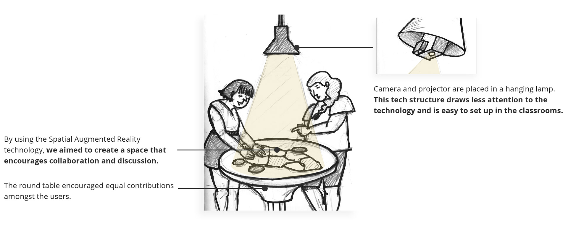
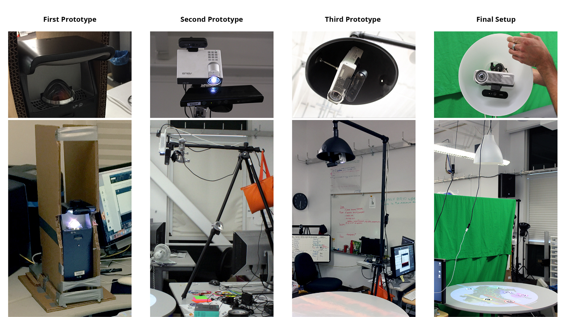
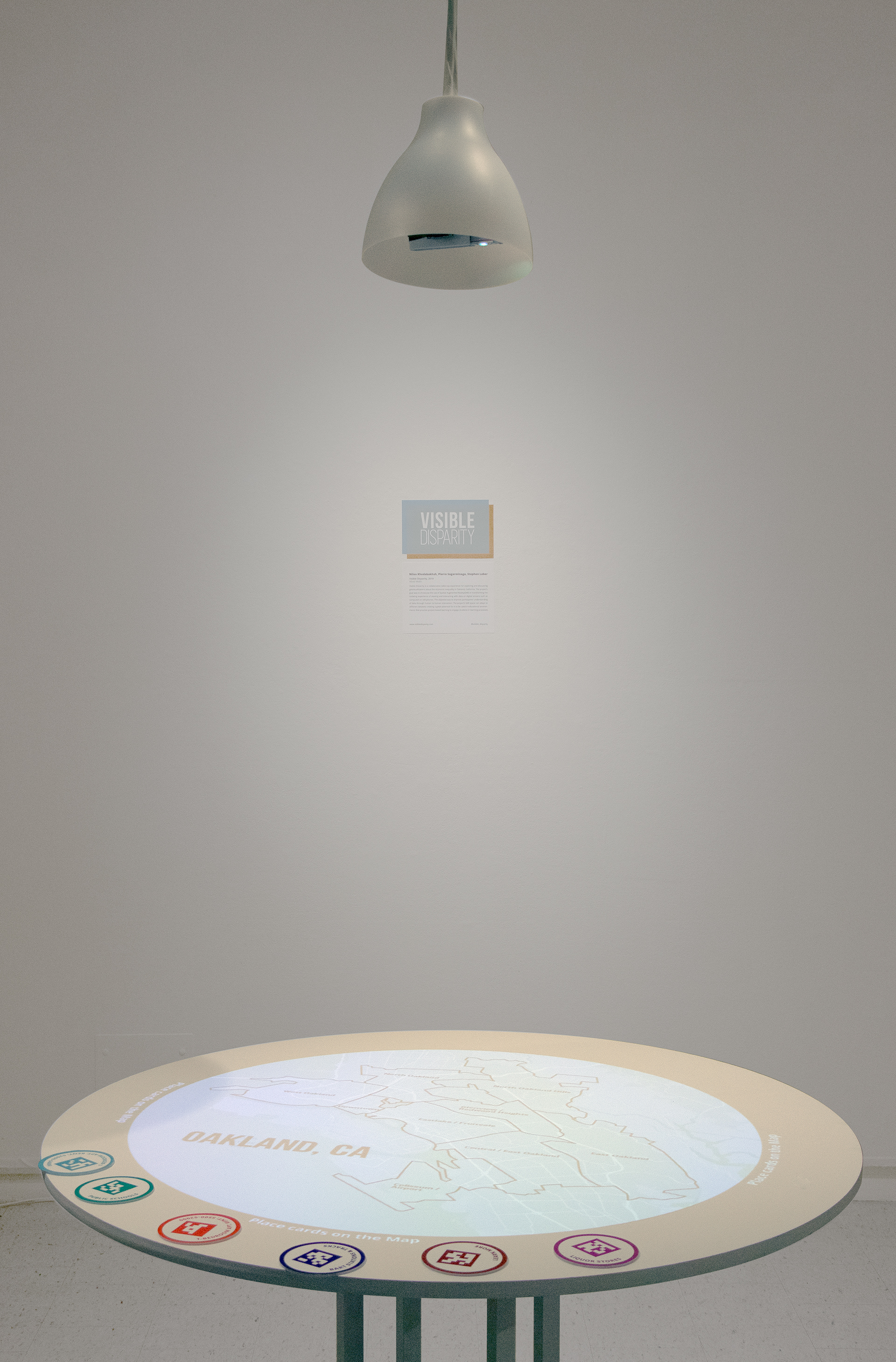
To create the SAR environment, we used another library called PapARt. PapARt, too, worked in Processing environment. PapARt required a camera and a projector to track the users’ hands movement and display the relevant information. There were two parts to creating the SAR space. First writing the code and second working out the perfect alignments for the camera and projector.
We tried different setups and angles until we decided on the final version which was embedding the equipment in an IKEA lamp, hanging from the ceiling.
AR Marker Cards
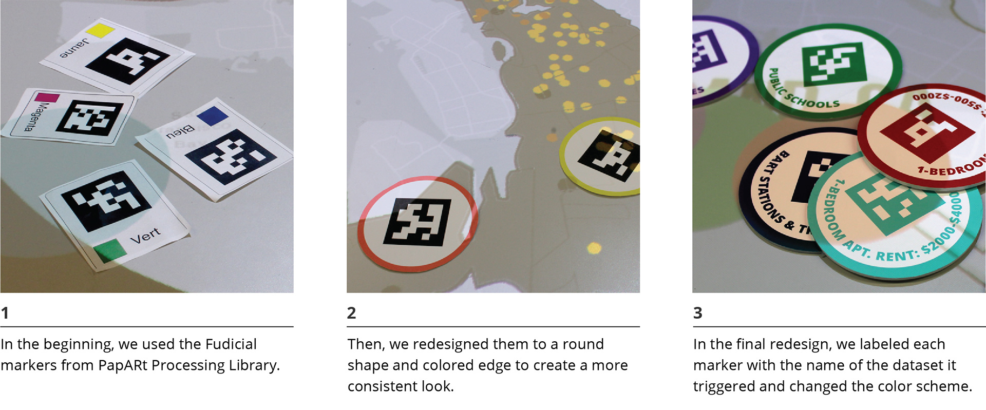
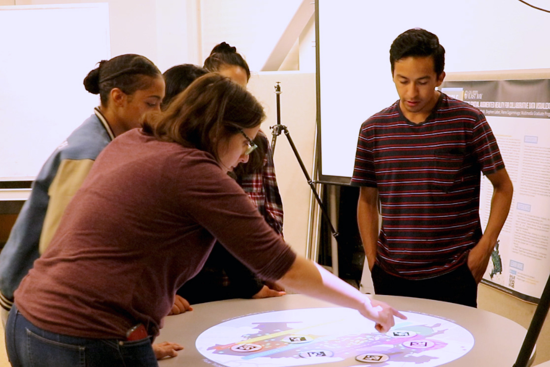
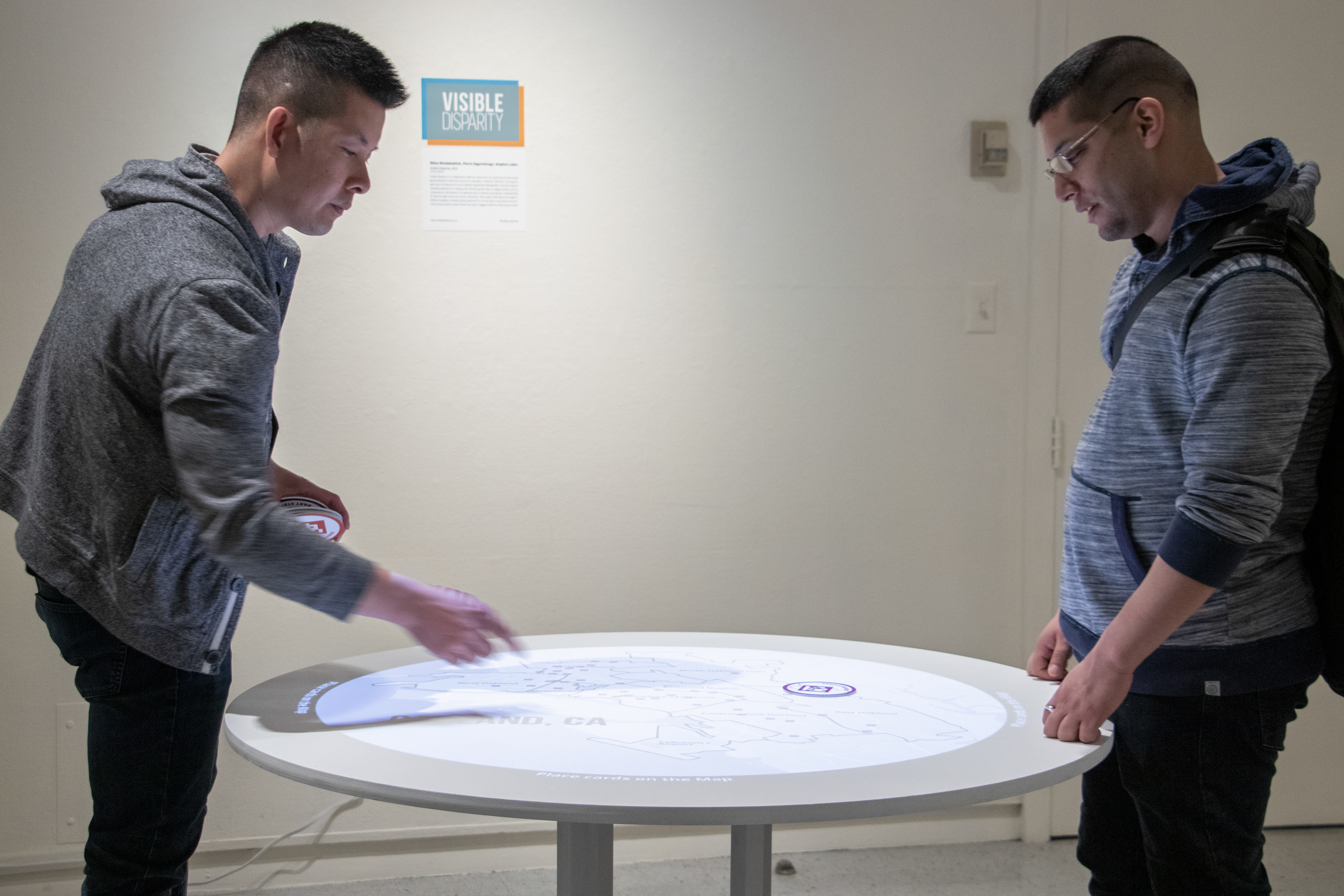
Along with experimenting with different setups for the camera and projector, we worked on the code to bring the data visualizations into the SAR environment. This meant assigning one AR marker to each dataset. Each AR marker triggered one data visualization to appear. By placing the AR marker on the table the assigned dataset appeared and by removing it the dataset disappeared. My role at this point was to merge the data visualizations code with PapARt and assign AR cards to datasets.
The looks of AR cards went through multiple changes. I chose to use the round shape for the cards and the typography arrangement to create harmony between our project's round table and the cards.To help users understand which AR card is assigned to which dataset, I decided to color code the edges of the cards. Moreover, a deck of color cards on the table quickly linked users to previous game-play memories and prepared them to enter a group experience.
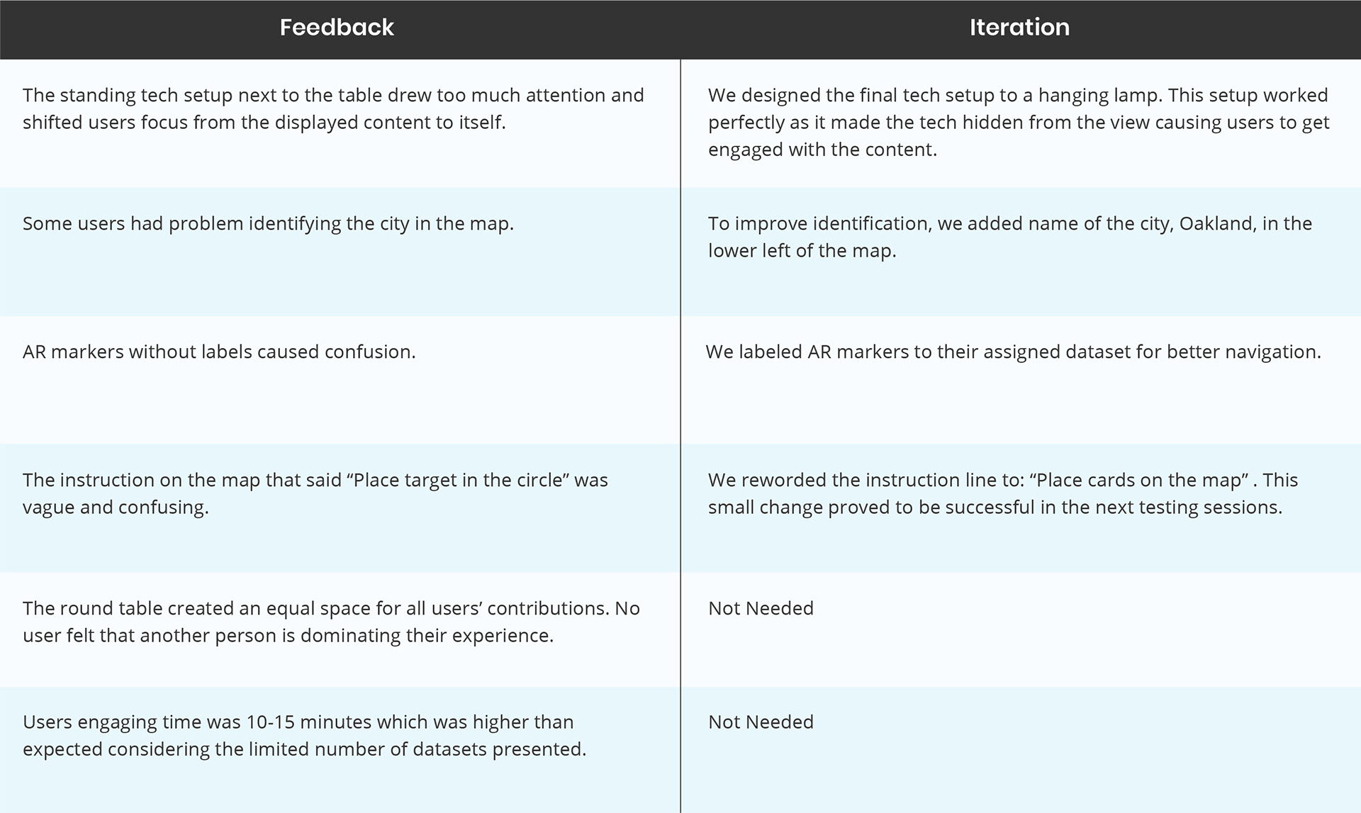
Testing & Feedback
We had five testing sessions in total. Our testing sessions were usually divided into two sections. First, observing users' interactions without interrupting their experience and second, a Q&A session with them to asked follow-up questions.
In Each testing session, we asked questions related to the stage of development that we were at. However there were a few points that we measured every time to determine the success of our prototype.
What we tested:
• Did the interactions make sense to the users?
• Did users start discussing their findings?
• How much time on average users spent in the experience?
• what did not work or was confusing?
• Did the interactions make sense to the users?
• Did users start discussing their findings?
• How much time on average users spent in the experience?
• what did not work or was confusing?
Final User Testing Session at Makerfaire 2019

User Testing at Makerfaire 2019, San Mateo
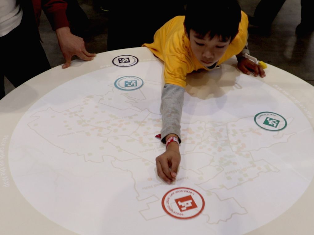
User Testing at Makerfaire 2019, San Mateo
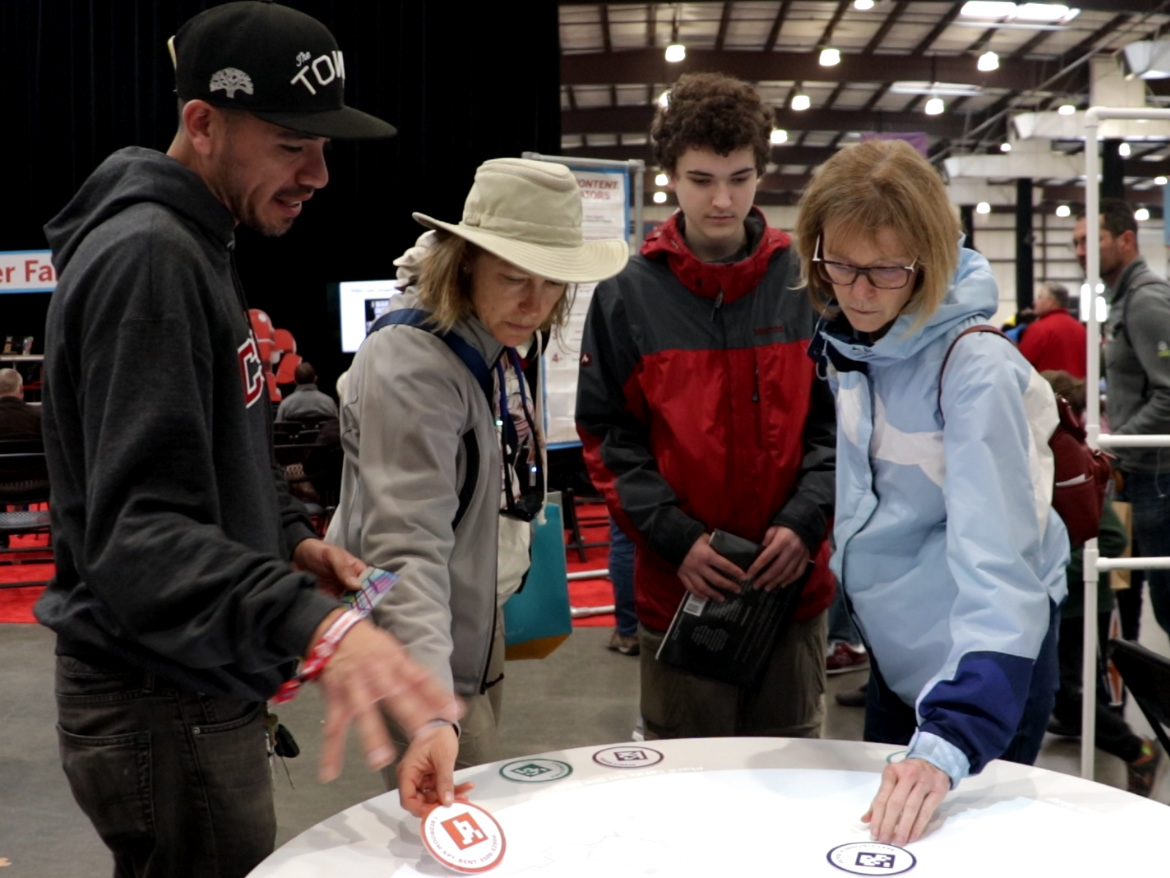
User Testing at Makerfaire 2019, San Mateo
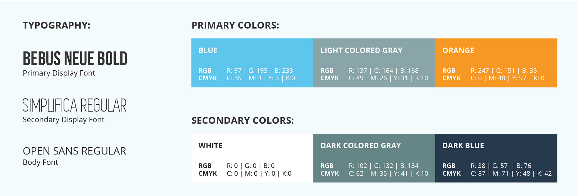
Visual Identity
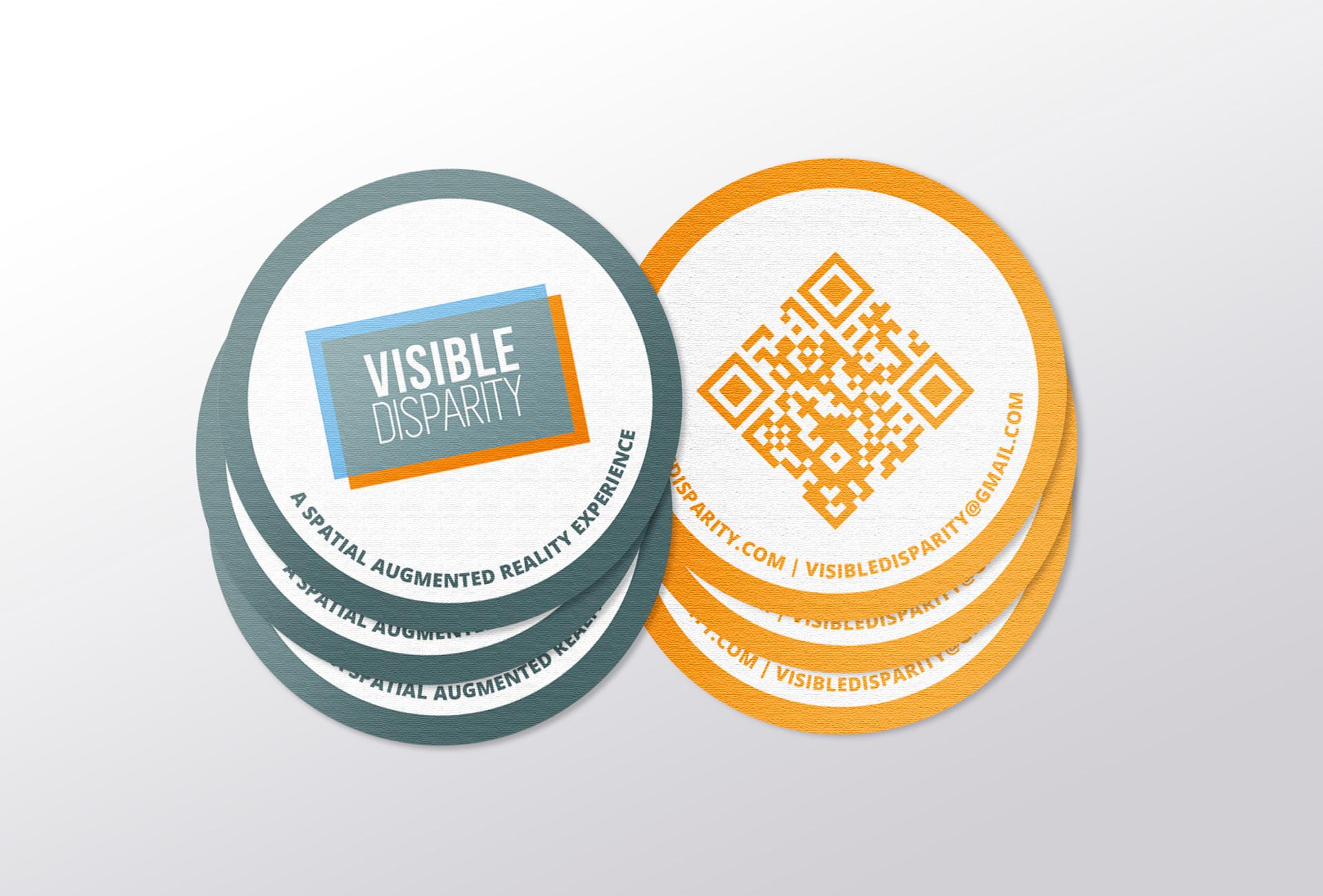
I designed the project’s visual identity and promotional material. This included designing our logo, business card, conference poster and panel for Makerfaire.
Logo & Business Card Design
Poster for Center for Student Research Symposium & Panel for Makerfaire 2019
Key Results
• The SAR space proved to be an excellent platform for groups to discuss data visualizations.
• The gamification aspects such as color scheme and cards improved the experience.
• Users embraced their freedom to explore datasets of their choice.
• Users automatically discussed the datasets during and after the user testing sessions.
Exhibition at University Gallery, Cal State East Bay, Spring 2019
Check out our video: