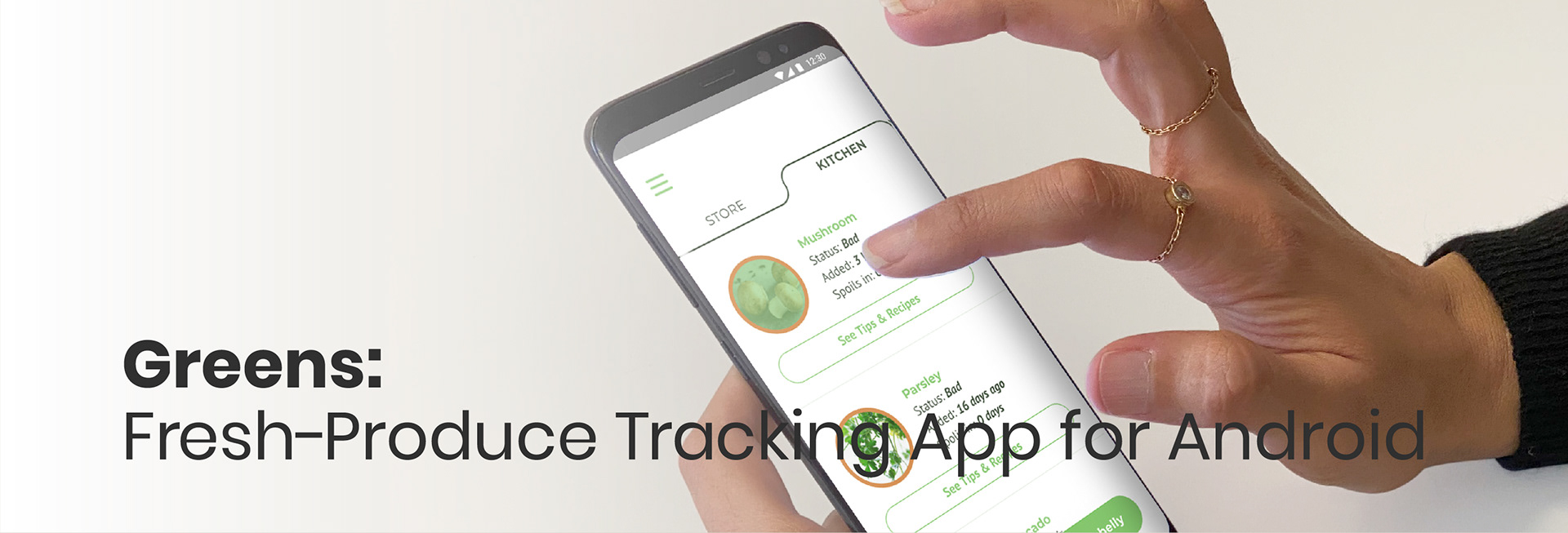
Roles: UX/UI Designer
Key Skills: UX Research & Design, Visual Design, Prototyping
Duration: 2 Weeks
Tools: Figma, Adobe Illustrator, Adobe Premiere Pro
The Problem
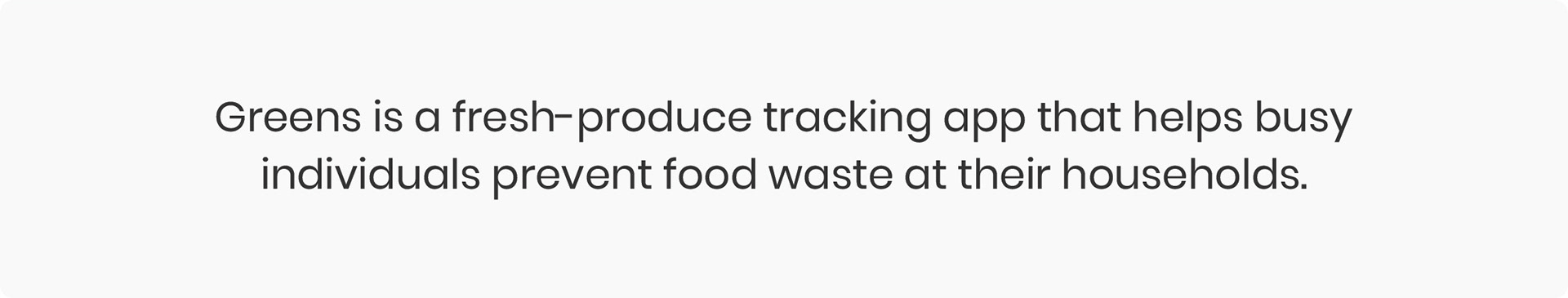
Households are responsible for the largest portion of food waste in America. Guilty of throwing out food from time to time, I went on a mission to understand why so much food is wasted at our homes and how we can prevent it from happening.
Main Goals
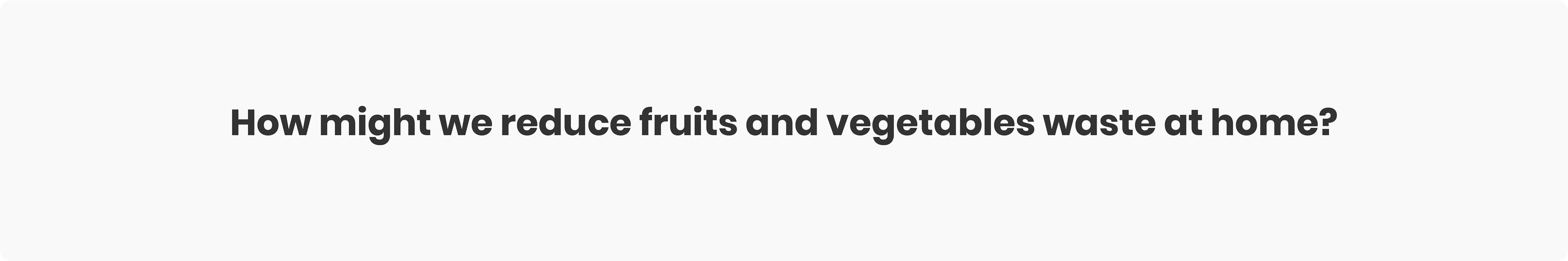
The goal was to design an app that helps individuals reduce their food waste at home. With that in mind, I proceeded to the research stage.
Understanding
the Users
the Users
I interviewed 7 people between the ages of 25-34 years old about their shopping and cooking habits to understand why they throw out food.
After analyzing the interview data, I came to the following conclusions:
► Busy life schedule: Most interviewees work and study at the same time so they have a very busy life schedule.
► The most thrown out foods are fruits and vegetables.
► Top 3 reasons for food waste at home are:
• Shopping more than need because they can’t remember what they have at home
• Forgetting to consume the food they buy
• Not having enough time to cook
• Forgetting to consume the food they buy
• Not having enough time to cook
Based on the interview data, I narrowed down my initial goal of reducing all food waste to focusing only on the most wasted foods: fruits and vegetables.
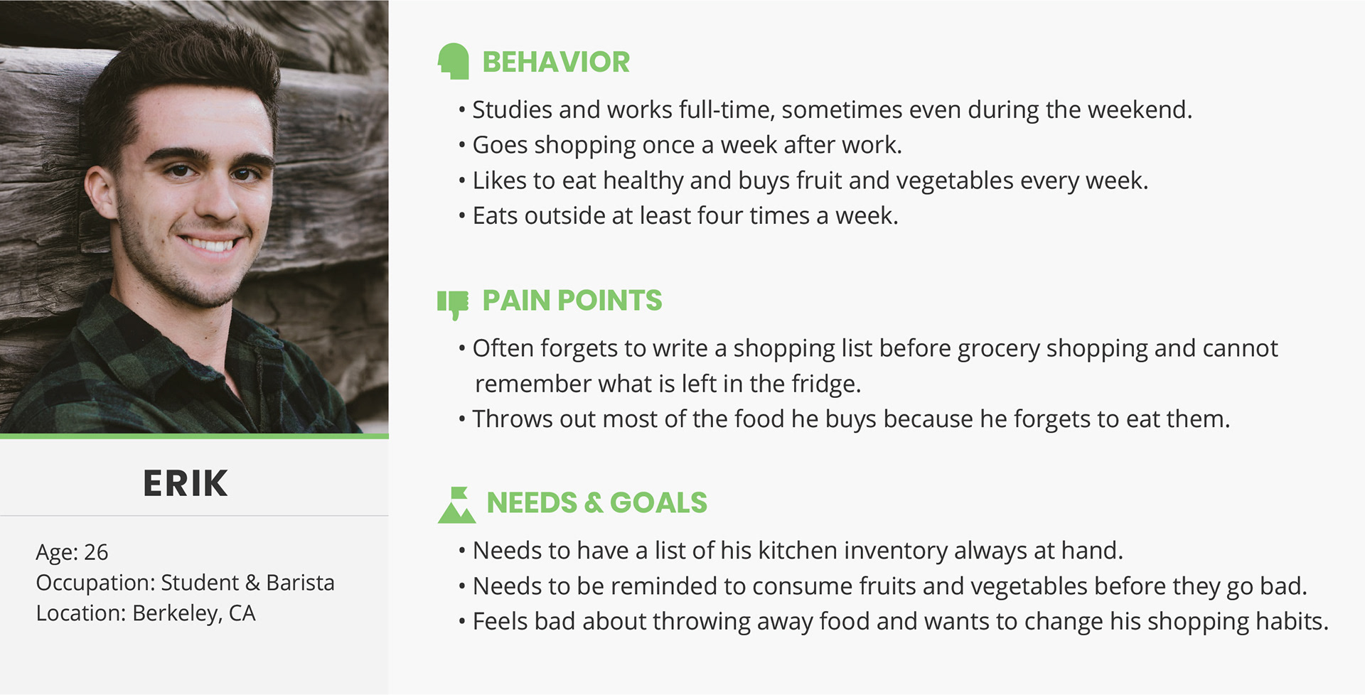
User Persona
I created a provisional persona of a potential user of Greens app based on the interview results and my general understanding of people who have this problem. Although this persona, for the most part, was based on assumptions and not comprehensive research, I still referred back to it to make better design decisions and set priorities along the way.
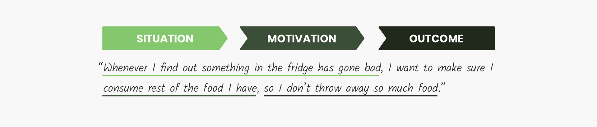
User Job Story
To understand users' motivations and desired outcomes, I used the Jobs to be Done Framework which focuses more on the context in which a user will be using a product.
I created the following job story for the provisional persona that I had created earlier:
Diving deeper
into the problem
into the problem
To achieve the main goal of the project, I needed to understand the problem better. So far I knew that overbuying, forgetting to consume the food and not having enough time to cook were the common reasons for food waste at households.
But was there any reason for waste that was specific to fruits and vegetables?
After following up with the interviewees, I concluded these two main points:
► Fruits and Vegetables are relatively cheaper than other food products, so having to throw out some of it did not concern most people.
► In general, fruits and vegetables do not last long and not everyone knows how to store them correctly to increase their shelf life.
Ideating the Solution
Having enough information to start off the app design process, I created the following sketches of how the Greens app can help users reduce fruits and vegetables waste at their household.
The app meant to the reduce waste by offering the following features:
► Having a list of kitchen inventory always at hand to reduce buying duplicate items caused by forgetfulness.
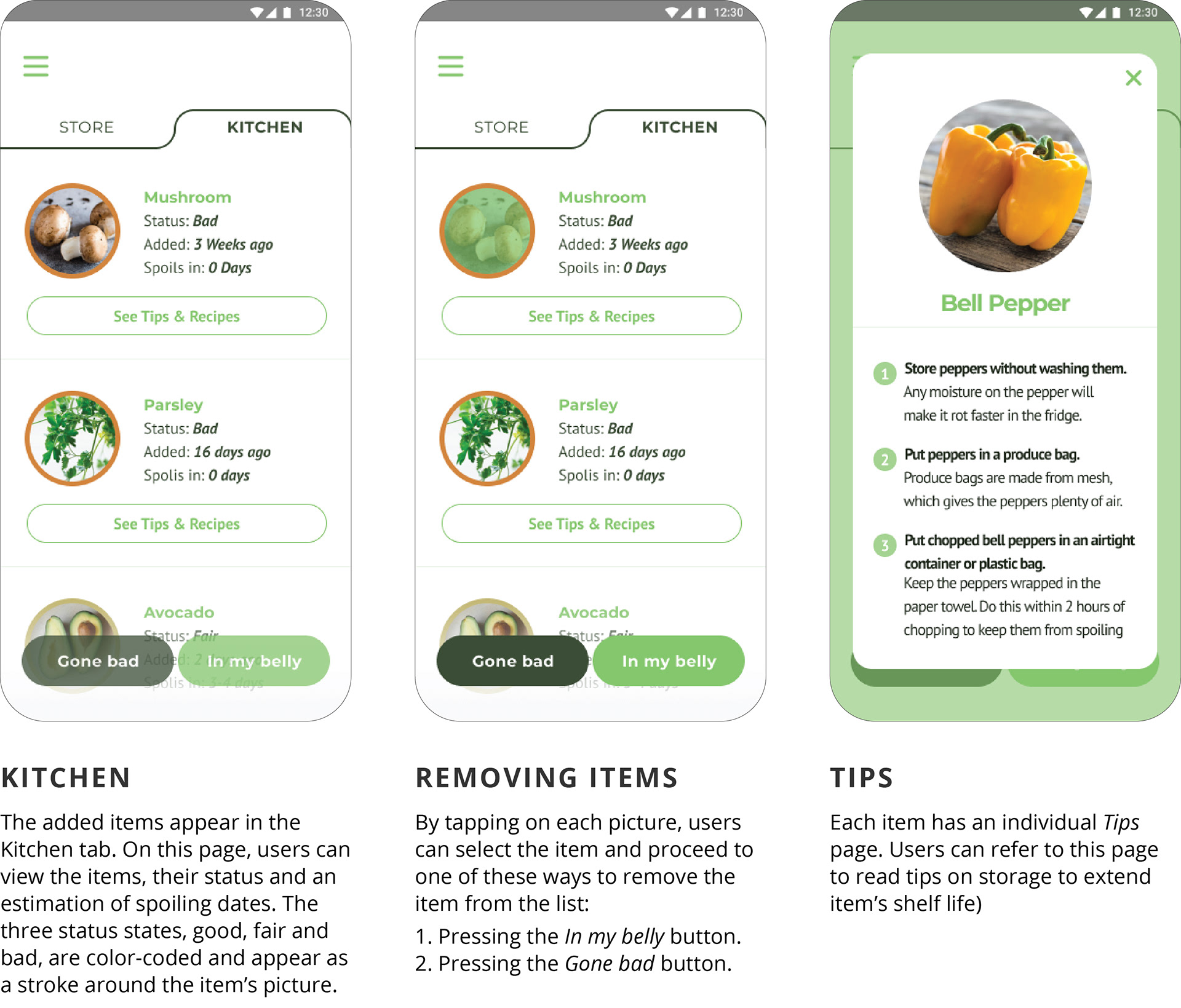
► Keeping track of items' estimated spoiling date and reminding users to consume the food before it goes bad.
► Giving easy storage tips for the purchased items to increase items' shelf life.
I sketched low-fidelity wireframes to visualize the experience the users would have as they sign up for the app and add items to their virtual kitchen.
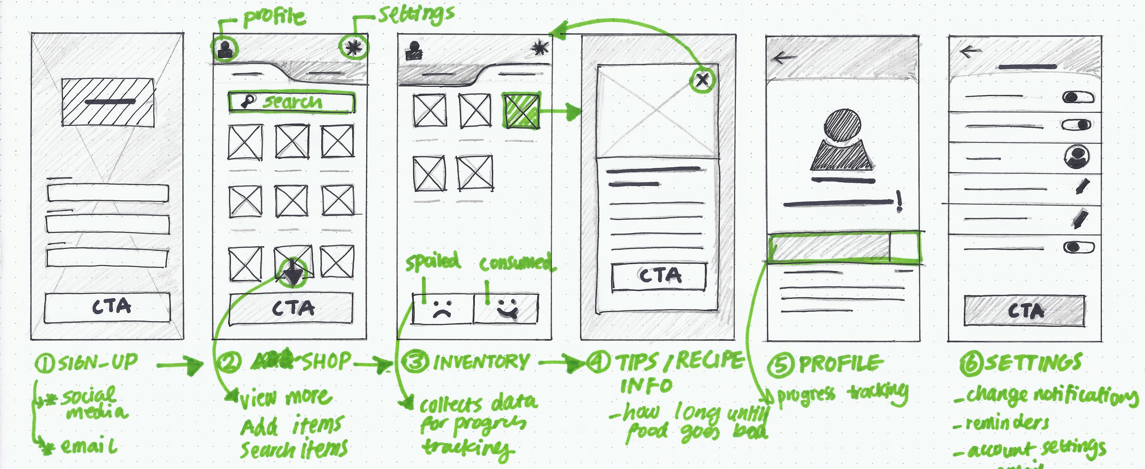
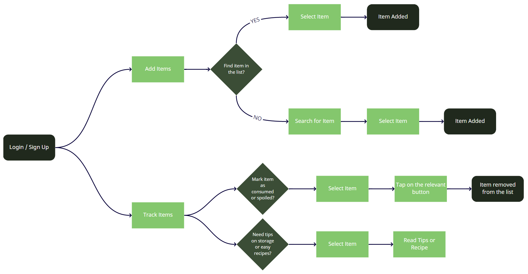
Next, I created the user flow of the two main actions that users can take on the app: adding and tracking items.
I designed mid-fidelity wireframes to finalize the app layout and structure.
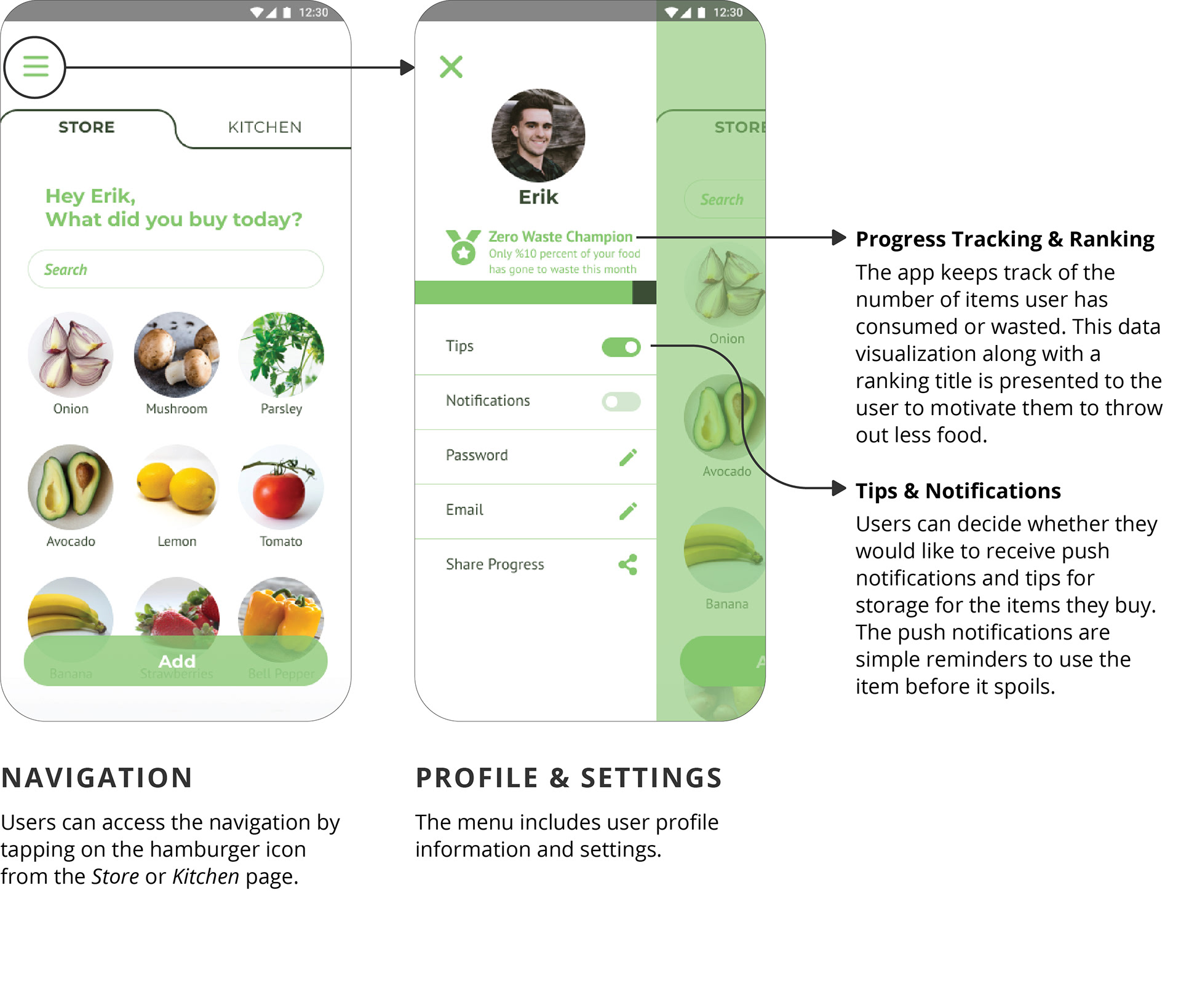
At this stage, the Profile and Settings pages were implemented into a hamburger menu in order to create a better user experience.
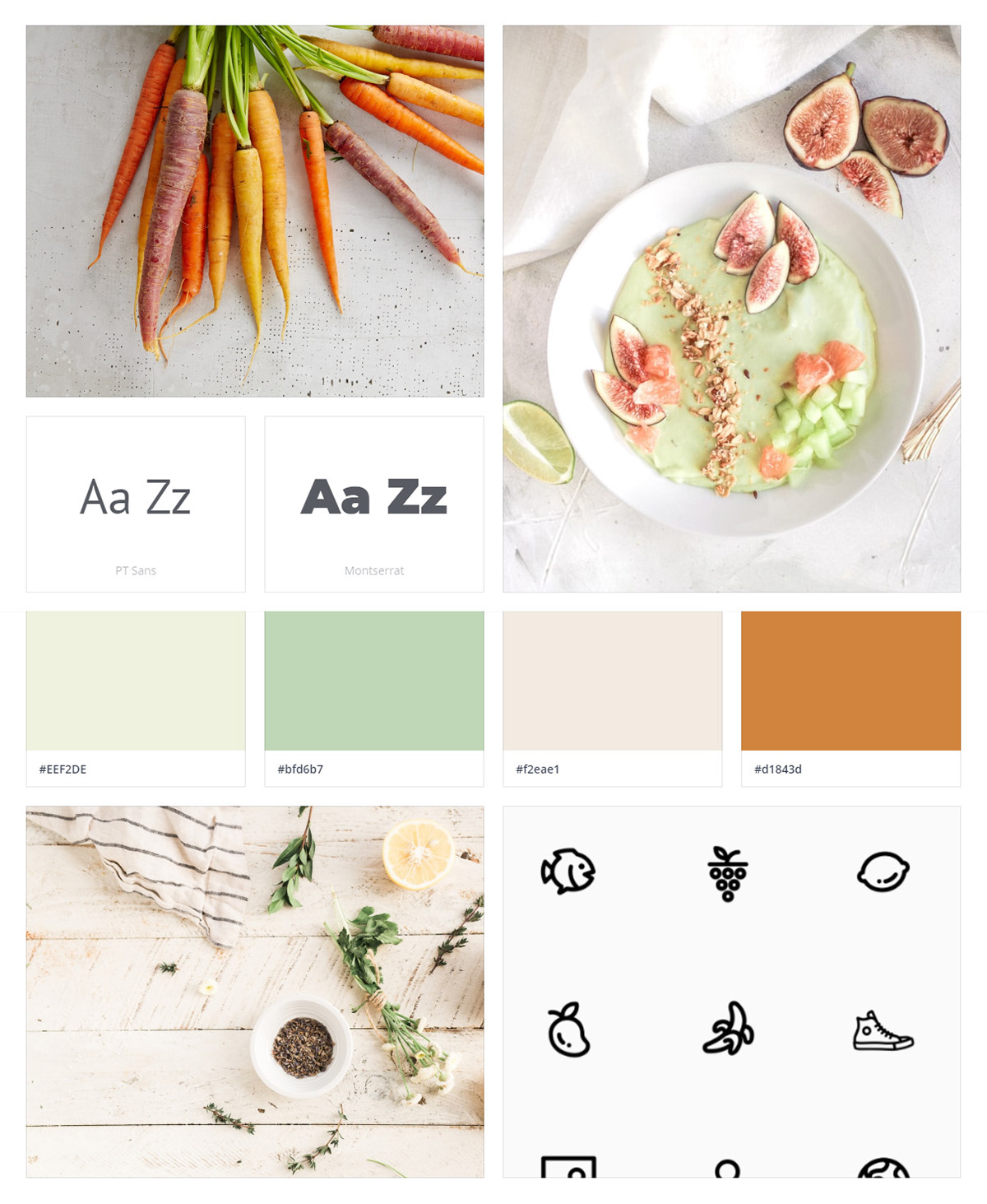
Visual Inspiration
Before creating the visual design of the app, I observed pictures, colors, icons and other design elements that conveyed the same mood I envisioned for the app.
I created a moodboard from my inspirations that helped me start the visual design process. Although some visual design decisions took a different turn later on, the characteristics still remained the same.
I planned to design the app to have the following characteristics:
• Light Color Scheme
• Minimalistic Layout
• Modern
• Easy to the Eye
• Smooth Interactions
• Sans-Serif Typefaces
• Round Iconography
• High-Quality Pictures with a Light Background
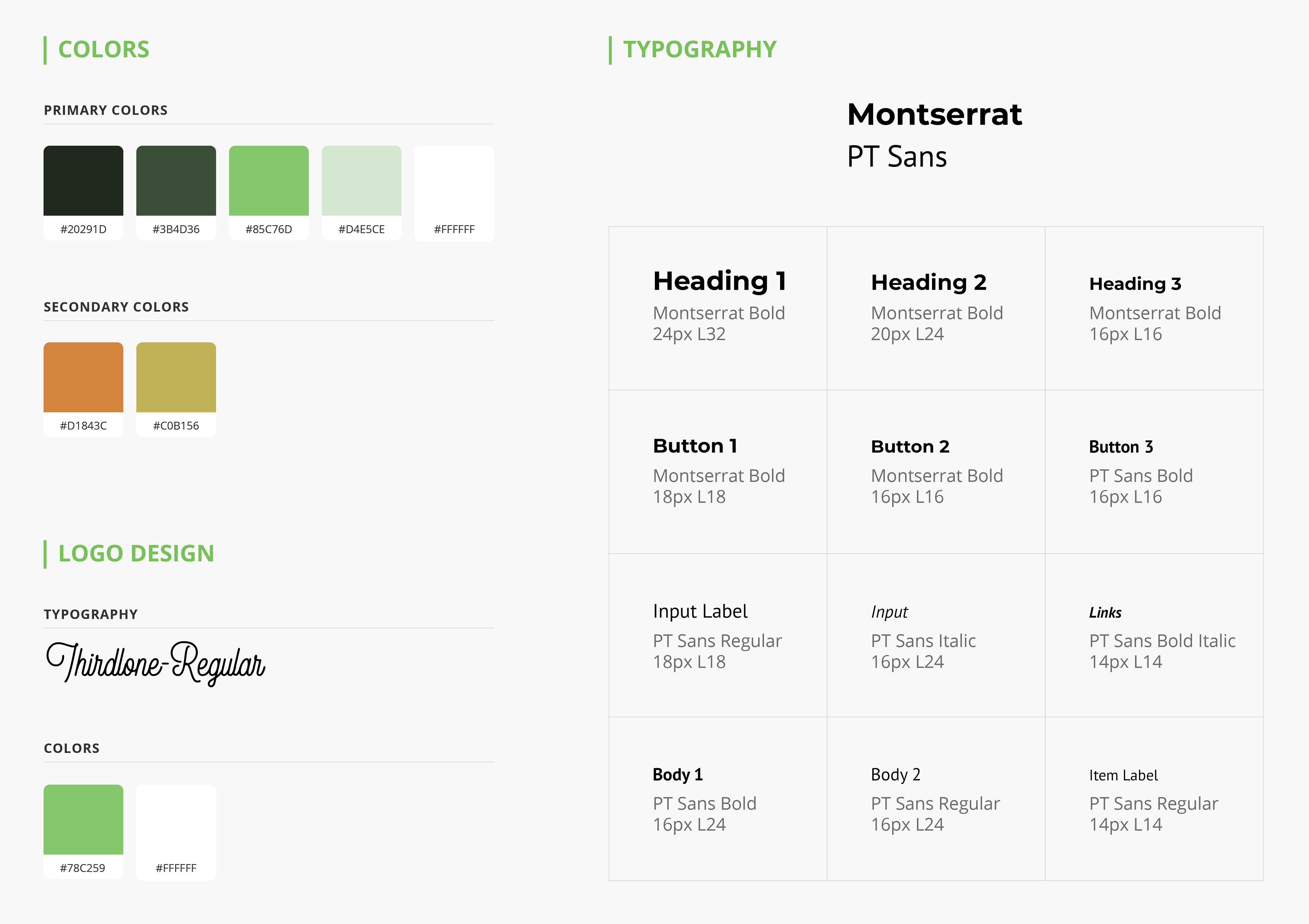
Visual Design
& Style Guide
& Style Guide
After exploring different color schemes and typography, I made the final design decisions. Since having several pictures on the screen draws too much attention, I designed the interface using light colors and minimal typography to avoid clutters and distractions.
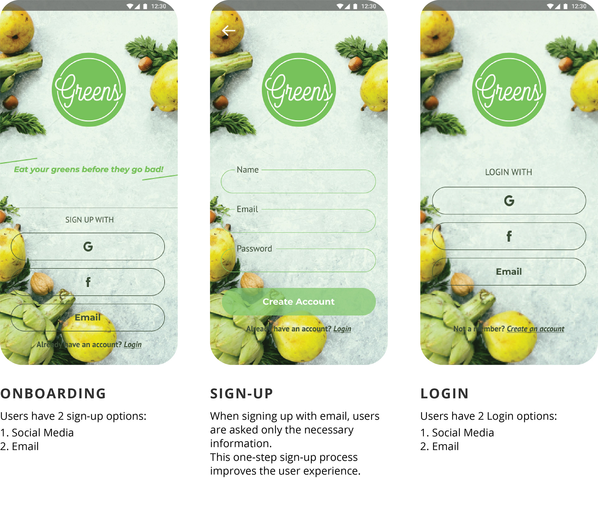
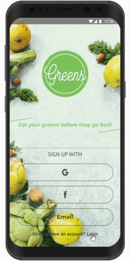
Final Concept
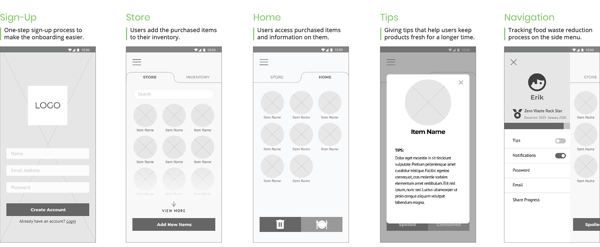
The final concept included the following states and functionality. I designed a polished and minimal look that represented the initial design ideas about freshness and created an interactive prototype to map users' main interactions on the app. In the design process, these interactions were iterated and revised based on feedback from potential users.
The final app concept can be divided into these four flows:
1. Sign-Up / Login
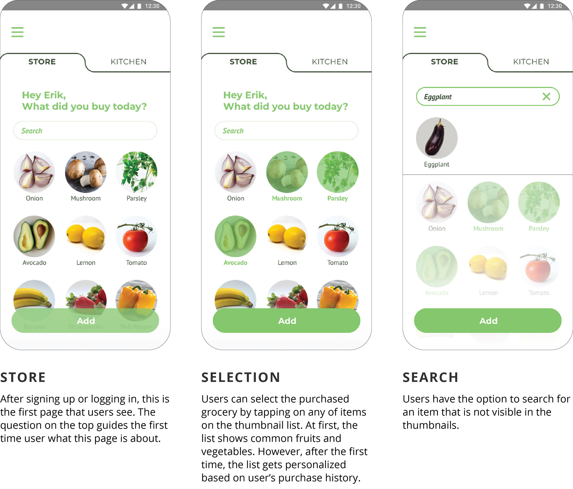
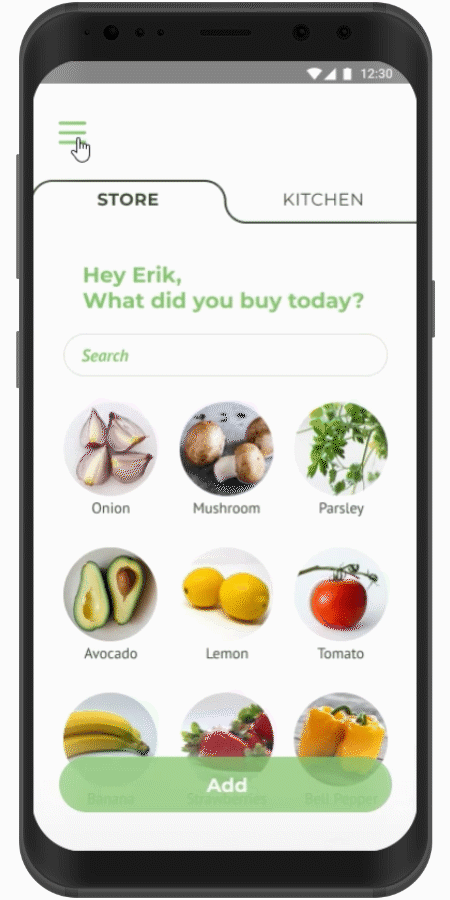
2. Adding & Searching for the Items
3. Managing Purchased Items
4. Navigation & Progress Tracking
1. Sign-Up / Login
2. Adding & Searching for the Items

3. Managing Purchased Items
4. Navigation & Progress Tracking
Usability Testing
To test the app concept, visual design and interactions, I formed a usability testing session with a few college students. I asked them for their feedback on the functionality and aesthetics. While most users liked the overall concept, they wanted to see more features on the app, such as a page where one could create a shopping list or linking the app to a cooking app where they can find recipes for their purchased items.
Learnings
Most people may not be conscious of how much food they throw away every year, but when talked to and explained they are willing to take easy steps to reduce waste in their households which is why the app concept proved to be popular among the target users.
Given more time, I would have improved some features like the progress tracking or added new ones such as a shopping list page.