Flyer Redesign for Breast Cancer Rehabilitation
Client: TurningPoint Breast Cancer Rehabilitation | Year: 2019 | Tools: Adobe Illustrator
About
TurningPoint Breast Cancer Rehabilitation is a non-profit organization that improves the quality of life for women with breast cancer by providing, promoting and advocating specialized and evidence-based rehabilitation.
Design Brief
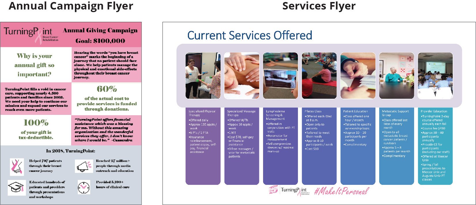
TurningPoint is mostly funded through donations and every year, they hold a campaign to encourage more donations. For this purpose, they had an annual campaign flyer (picture on the left) and a flyer that lists the services they provide (picture on the right).
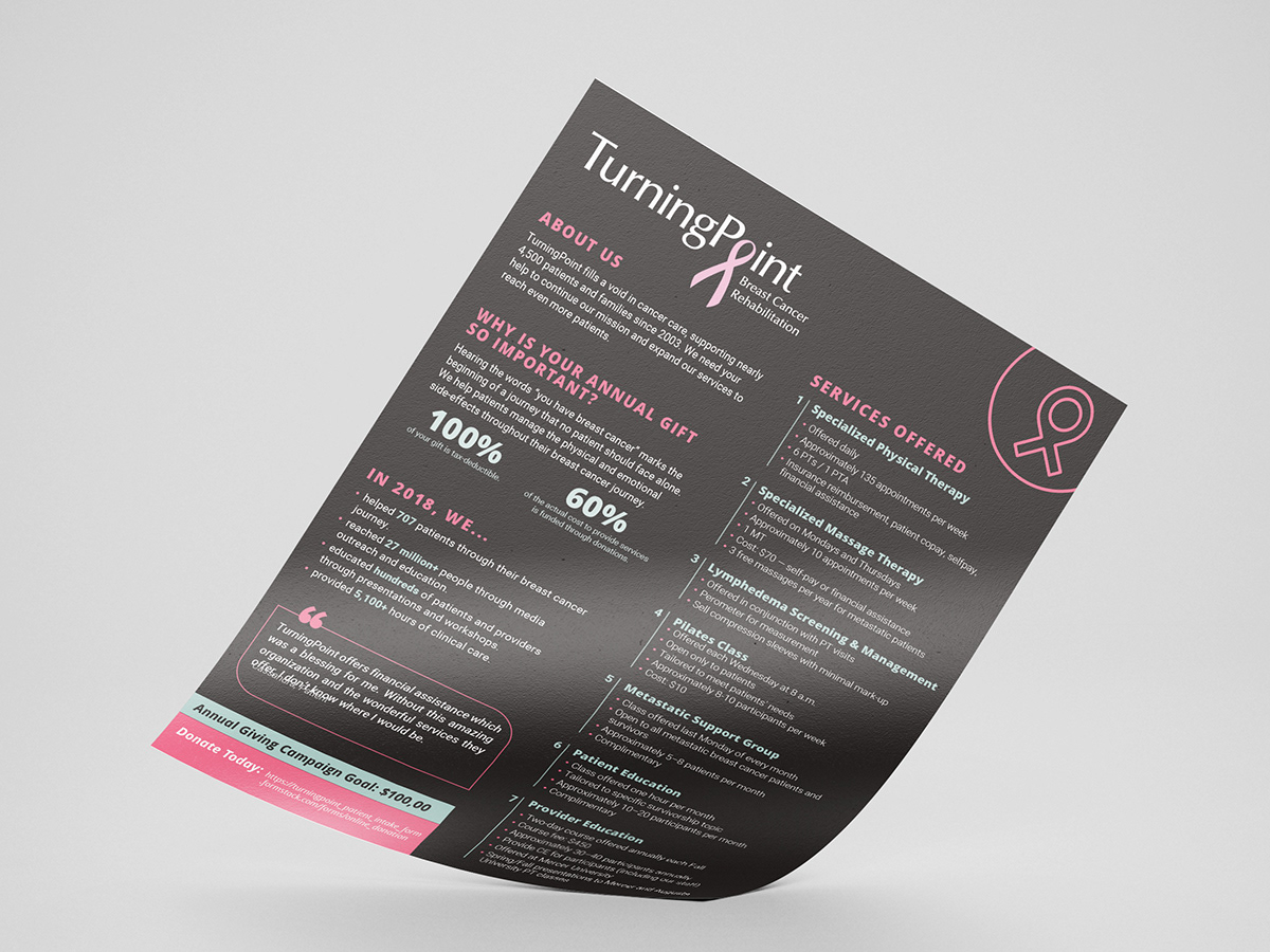
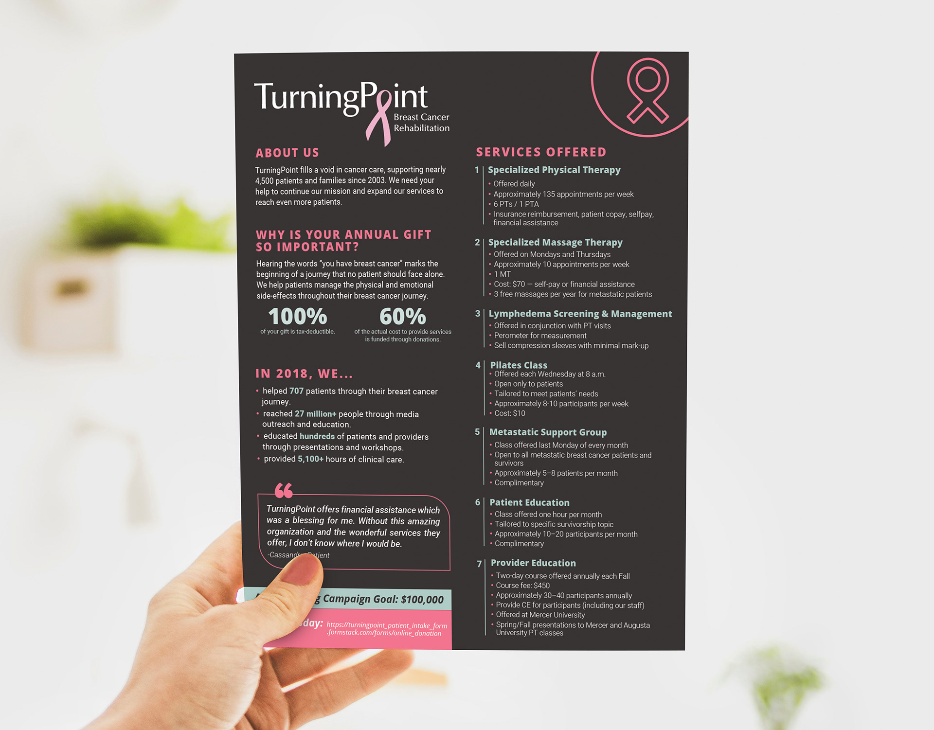
They asked me to redesign the flyers into a letter-size document that includes all the information in the previous flyers. In addition, they were interested to see a design that reflects the company's mission and goals through its visual language.
The problem areas:
• Poor hierarchy of information
• Hard-to-read text
• Inconsistent color scheme
• Irregular size of the Services Flyer
The Process
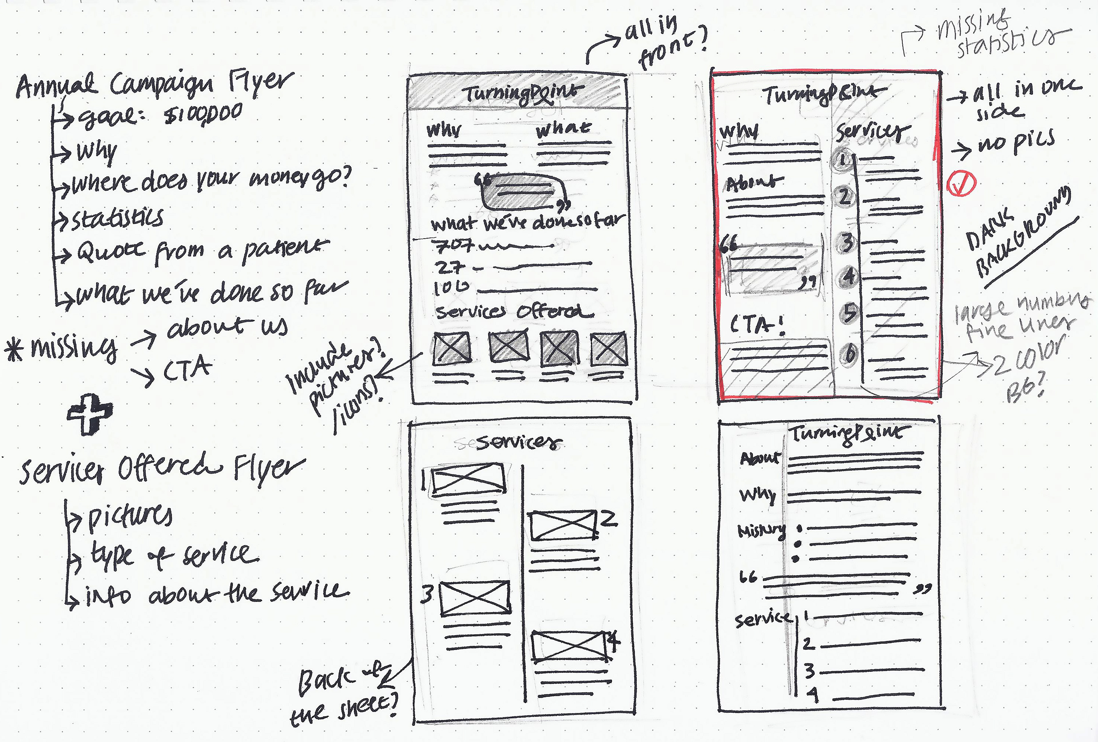
To design the flyer, I went through this process:
1. Defined the problems of previous designs
2. Organized and categorized content of the flyers
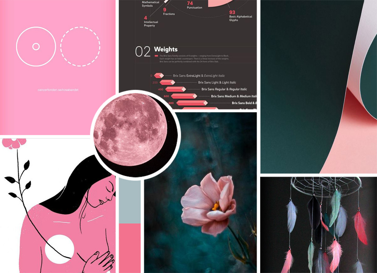
3. Researched design aesthetics of posters or flyers with the same subject matter and created a moodboard
4. Sketched out some concepts and shared them with the client
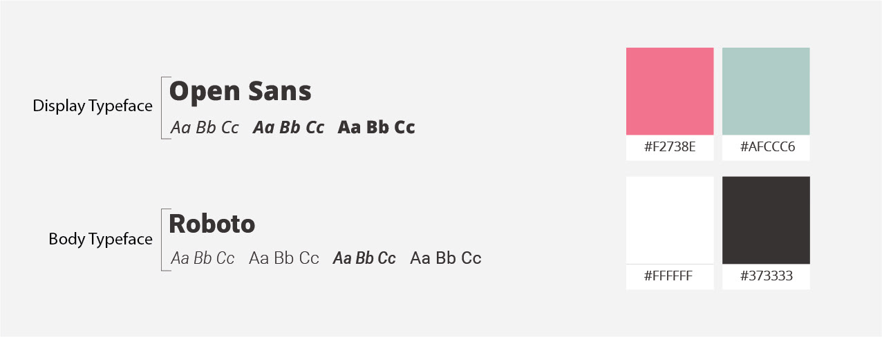
5. After the client's approval of the main concept, I made visual decisions such as colors & typeface choices.
6. Designed the final flyer
Sketches
Moodboard
Colors Scheme & Typography
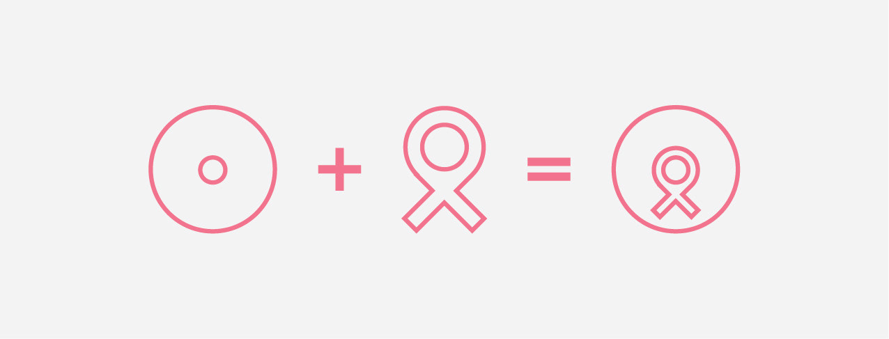
Icon Design
Final Flyer Design